I’ve known for a little while that I have more images of tools than I have space allotted in the book.
My working assumption had been that I would have less images of masks and amulets. Where sets and figures provide the opportunity to shoot many images from one shoot: move the figures, change the lights, swap the scenery around, more smoke and you’ve got new scenes. Singular props like masks and amulets are not so easy to work with. You get one per thing, or you’re recycling, which I’m trying very hard not to do. Who wants “recycled” images?
But it turned out that I actually had a lot more masks than I thought. And even a few spare amulets. Great!
I also have more images of food and tools. I think they’re significant enough to include.
The pagination of the Redux Edition was originally based 100% on the first edition, just to get us started and to make use of that pre-existing layout work, which I see no need to change. I like it. But (at the time of writing this article - at the time of posting the book is done and one has been printed!) with everything bar one page of images now complete, I can go back and see if there’s things I want to change in terms of pagination.
“Pagination” means how the content of a book is split up into pages. And by inference the word is also used to talk about the running order of those pages and that content.
At this stage the book can happily expand beyond the original 144 pages, and I feel the imagery really is “high value” content. The setting and inspirational material of Maskwitches resides in no small part in the art. When expanding a book we have to work in both spreads and signatures:
Spreads are the term for two adjacent, facing pages.
A signature is the smallest set of pages that a given printer works with: books are not single pages bound together, and indeed a single page in a book is one side of a piece of paper - so cannot exist alone without something on the other side of it.
Most folks are aware that book pages are actually formed by one sheet of paper that has four pages on it. These are folded and stacked up to make the book. We’re a bit hampered in English by using “page” to mean both one and two sides of a book. Thanks, William Shakespeare or whoever.
Four pages is the smallest signature that most printers can do, and signatures that small are relatively rare in my experience. So we probably need to add pages in signatures of 8 or 16 sides.
The maths of signatures is why books are most typically made in multiples of 16 pages - 32, 64, 128, 160, 256pp and so on.
(The abbreviation of “pages” to “pp” is a hangover from Latin and the way it pluralises abbreviations.)
Which pages face one another in a book is also important for the flow of the book, and sometimes a tricky puzzle to crack. You can’t just add one side to a book (there has to be something on the other side of that page!) and adding an odd number of pages into the middle of a book potentially really messes with the way the pages lay - the pagination.
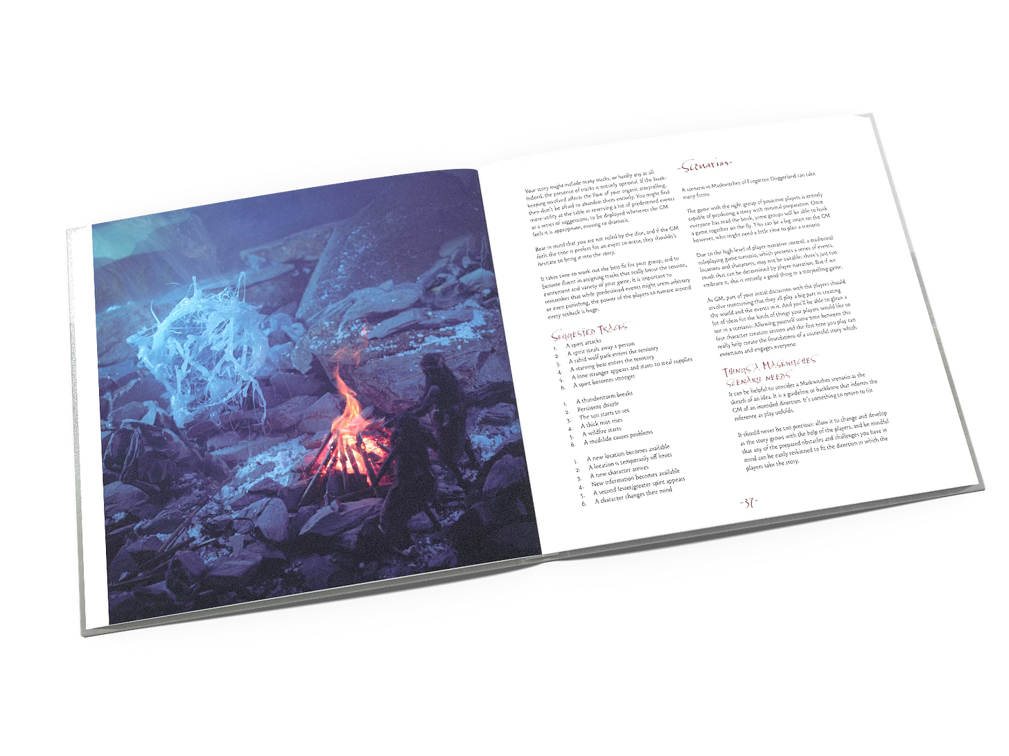
In Maskwitches we have the rule that images sit on the left of a spread, text on the right hand page. Where we have a lot of text that needs to be together it will form a spread. Likewise we’ll allow multiple pages of images. But in a spread containing both text and images, text is always on a right hand page, art on the left.
So if we find ourselves wanting to insert a single new page into a pre-existing spread it will really alter the running order and left or right hand placement of pages in the book.
Traditionally, facing pages are termed recto and verso in Latin, but we don’t use that terminology at Handiwork Games, where left and right are readily available words that serve the same purpose. We’re a but inconsistent in which traditions we honour! Good!
Additionally, wherever possible in Silver Road titles with their square pages, I like to aim for one topic per page, or at least one per column. That’s not easy or even possible to get perfectly right and we do need to be mindful of the initial reading experience as well as the later reference experience.
The monetary cost to the reader is also always a factor. Longer book, higher price, and white space costs us the same as printed space. Space has a positive utility, and I’m certainly in favour of letting text breathe so that it’s easy to read and reference. But we’re not all rich, right? (I’m certainly not - have you seen how I spend my time? Making art? Ewww)
Being able to talk about the manipulation of pagination in conversation with Paul Bourne, our layout artist, is an art that needs practise. There’s a language and process which we’ve developed across years of working together so that we minimise the stress of breaking a book in order to fix it.
Update: I’m very happy to report that we fixed all the wrinkles, and the book is complete at the time of posting. We’ve even had the first copy printed to show off. I’ll be making a post about that very soon!
You can now sign up to be notified when the campaign to raise funds to print the book of Maskwitches Redux Edition goes live. Sign up here.


